
Website wireframe design gives the team a plain working plan for structure, content priority, and user flow before a website page becomes a polished design. It shows what the page needs to do, where key elements belong, and which decisions should be settled while changes are still easy.
A custom website gets expensive when structural decisions wait until the mockup, prototype, or development build. Wireframes give your team and your web design services partner a place to agree on what the page needs to do before color, imagery, and final copy make the conversation harder.
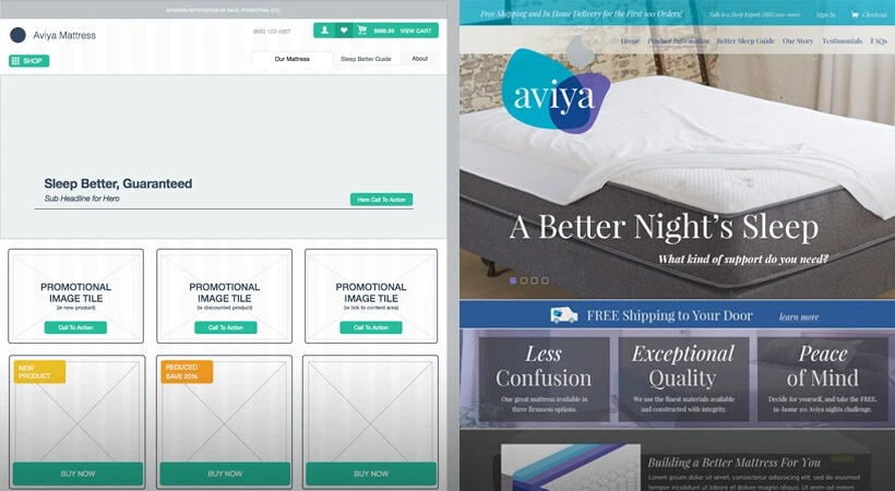
What Is Website Wireframe Design?
Website wireframe design is the process of creating a preliminary visual guide for a website page, template, or user flow. A wireframe shows the basic framework: what content appears, how information is prioritized, where functional elements live, and how a visitor is expected to move through the experience.
Think of it as the blueprint for the page. It is detailed enough for stakeholders, designers, developers, and content teams to discuss structure, but not so detailed that everyone starts debating the shade of a button or the final photo choice.
That restraint is the value. Figma describes a wireframe as a simple visual guide for a website or digital product’s skeletal framework. Yale’s usability guidance frames wireframes the same way: simple sketches that show structure, layout, and how users move through the experience before final colors or detailed visual design.
How Are Wireframe Designs Created?
Wireframes start with what the design team knows about the project. That usually includes the proposal or scope, sitemap, audience needs, content requirements, user flows, integrations, forms, conversion goals, and any custom functionality the site has to support. The wireframe designer can only work from information the project team has gathered, so this stage is a two-way street. Clear client input makes the wireframe stronger.
The format can be simple or detailed. A wireframe can begin as a sketch on paper, a whiteboard session, a low-fidelity digital file, a structured design file, or a browser-presented layout. OuterBox designers often prefer showing wireframes in a browser when the project calls for it, because the presentation feels closer to the website’s future environment.
Most projects do not need every possible fidelity level. Low-fidelity wireframes use simple boxes and lines to test layout. Mid-fidelity wireframes add clearer navigation labels, content blocks, and hierarchy. High-fidelity wireframes may include more precise measurements, annotations, or sample content, while still avoiding final color and imagery.
The important part is not the tool. The important part is that the custom website design process answers structural questions before visual design locks the team into a direction.
The Role of Wireframes in Web Design
Wireframes help the team decide how the site should work before deciding how it should look. That keeps feedback focused on structure, placement, hierarchy, functionality, and user flow. Digital.gov describes wireframes as a way to communicate design direction and support early usability and feasibility discussions. That is exactly the job they should do.
The easiest comparison is a floor plan for a house. A kitchen floor plan shows where the stove, refrigerator, sink, pantry, and doors might go. It does not tell you the refrigerator brand or the cabinet color. At that stage, the important questions are functional: can someone move through the kitchen, reach what they need, and use the space the way the home requires?
A website wireframe works the same way. The "appliances" are the site's functional pieces: navigation, forms, product grids, quote buttons, account areas, search tools, comparison tables, and content blocks. Before the visual design starts, the designer needs to know which pieces belong on the page, where they should sit, and how users should move between them.
Those decisions also help the web development team later. A clear wireframe gives development a cleaner map of what needs to be built and how the finished page should function.
What Should Be Included in a Website Wireframe?
A useful website wireframe shows enough detail for the team to evaluate the page structure without turning the file into a finished design. The exact contents depend on the project, but most website wireframes include:
- Header, navigation, and footer areas.
- Main content sections and their relative priority.
- Calls to action, forms, buttons, and other conversion points.
- Functional components such as filters, tabs, accordions, search fields, or account areas.
- Content placeholders showing where copy, images, video, product data, or proof points belong.
- Mobile or responsive notes when the layout changes by screen size.
- Annotations explaining behavior, requirements, or handoff details.
Yale's wireframe guidance names content hierarchy, layout structure, functionality, and content placement as core wireframe concerns. The Interaction Design Foundation adds annotations, which matter because a box on a page does not always explain what should happen when someone clicks it.
Keep this section practical in review. The wireframe does not need to answer every final design question. It should answer the structural questions that would be expensive to discover later, especially questions about content priority, required interactions, and what the next team will need to build.
How To Review a Wireframe Design Presentation
A wireframe presentation is not a passive walkthrough. It is the moment to test whether the page structure matches the business goal, the user’s task, and the project scope. Good feedback here saves revision time later.
When reviewing a wireframe, pay attention to:
- Information architecture: Does the page organize information in a way that makes sense from top to bottom?
- Priority of information: Does the most important content appear early enough, or is it buried below lower-priority material?
- Content strategy: Does the layout leave room for the type and amount of content the page actually needs?
- Page layout: Does the structure match the page role described in the project plan?
- Functionality: Are forms, buttons, filters, account tools, quote paths, or custom features represented in the right place?
- User flow: Can a visitor tell what to do next, where to click, and how to continue?
- Missing requirements: Is anything from the proposal, scope, or stakeholder discussion absent?
Placeholder copy is normal at this stage. Lorem ipsum or sample text keeps the review focused on layout instead of line editing. The exception is content length. If a legal disclaimer, product specification table, field label, or service explanation will materially change the layout, raise it during wireframe review.
Digital.gov recommends reviewing wireframes with user scenarios and personas in mind. Yale’s guidance suggests asking specific questions, such as whether a user can find the contact form or understand the navigation. That kind of question is more useful than a general “looks good.”

What Wireframe Feedback Helps Designers Most?
The best wireframe feedback is specific, structural, and tied to the user or business goal. It tells the design team what decision needs to change and why.
Useful feedback sounds like this:
- “The pricing CTA should appear before the comparison table because visitors ask about budget before they read feature details.”
- “This form needs an account-number field, and that field should be visible before submission.”
- “Mobile visitors need the store locator earlier because they are usually trying to find a nearby location.”
- “The approval workflow needs a second stakeholder before the request can be submitted.”
- “The product filter should appear above the grid because shoppers narrow by fit before they compare styles.”
Low-value feedback sounds like this:
- “Make it pop.”
- “Can we see the final colors?”
- “I do not like the placeholder text.”
- “This feels plain.”
Plain is fine during wireframing. Confusing is not. The goal is to catch the missing requirement, misplaced CTA, unclear user path, or incomplete functional note while the work is still easy to adjust.
What Not To Expect From a Website Wireframe
A wireframe intentionally leaves out details that belong later. That can feel unfinished if you are expecting a designed page, but the roughness is the point.
Do not worry too much about:
- Color: Wireframes are often grayscale so color does not distract from structure.
- Final imagery: Boxes or placeholders may represent photos, videos, icons, or graphics.
- Final typography: Font choices usually come during visual design after the wireframe is approved.
- Exact copy: Most copy is placeholder text unless the wording changes the layout.
- Pixel-perfect spacing: The wireframe shows relationships and hierarchy before final production spacing is refined.
This does not mean visual details are unimportant. It means they have their own stage. If everyone debates colors during wireframe review, the team may miss the real issue: the quote form is too low, the navigation does not support the buyer path, or the mobile layout hides the next step.
Wireframes, Mockups, and Prototypes: What Changes at Each Stage?
Wireframes, mockups, prototypes, and development builds answer different questions. Mixing them up leads to the wrong kind of feedback at the wrong time.
| Stage | What It Answers | What It Usually Shows | What It Is Not |
|---|---|---|---|
| Wireframe | Is the structure right? | Layout, hierarchy, navigation, functional placement, user flow | Final visual design |
| Mockup | Does the visual direction work? | Color, typography, imagery, branded components, polished composition | A fully interactive product |
| Prototype | Does the interaction work? | Click paths, simulated interactions, transitions, user-flow testing | Production code |
| Development build | Does the site work in the real environment? | Actual templates, content, integrations, responsiveness, performance | A planning artifact |
Figma places wireframes before high-fidelity mockups or prototypes in a traditional design process. IDF makes a similar distinction: prototyping is more about testing interactivity, while wireframing establishes structure and flow.
That sequence keeps the team honest. Structural feedback belongs in the wireframe. Visual feedback belongs in the mockup. Interaction feedback belongs in the prototype. Technical QA belongs in the build.
Why Strong Wireframes Make Better Websites
Strong wireframes make the invisible parts of a website visible early: hierarchy, flow, friction, missing requirements, and decision points. That gives the project team a cleaner path from strategy into design and development.
The finished website still needs design craft, content, development, testing, and post-launch care. But the build starts from a stronger place when the structure is agreed on first. The team has already discussed what matters, what is missing, what belongs on the page, and what should happen next.
That is why the wireframe stage deserves real attention. A quick approval can move the project forward, but a thoughtful review can prevent avoidable redesign work, awkward content fits, missed functional requirements, and late development changes. You are not approving polish. You are approving the plan the polish will follow.
Website Wireframe Design FAQs
What Is the Main Purpose of a Website Wireframe?
The main purpose of a website wireframe is to align the team on page structure, content priority, functionality, and user flow before visual design begins. A wireframe helps stakeholders review what the page needs to do while the layout is still easy to change.
Is a Wireframe the Same as a Mockup?
A wireframe is not the same as a mockup. A wireframe focuses on structure, hierarchy, and function. A mockup adds visual design decisions such as color, typography, imagery, and branded components. Wireframes answer whether the layout works. Mockups answer whether the visual direction works.
Should a Wireframe Include Real Copy?
A wireframe can include real copy when the wording affects layout, compliance, user decisions, or conversion flow. Otherwise, placeholder text is often enough. The goal is to review structure before the team polishes final sentences.
Who Should Review a Wireframe?
The right reviewers usually include the project owner, design lead, content lead, development lead, and any stakeholder responsible for required functionality or compliance. Too many reviewers can slow the process, but missing the person who owns a key requirement creates bigger problems later.
Can Wireframes Be Clickable?
Wireframes can be clickable when the team needs to test a user flow, menu path, form sequence, or interaction before visual design. Not every wireframe needs interactivity. Use clickable wireframes when the behavior is part of the decision, instead of adding clicks only because the tool allows them.
